Ontario has revealed the name for its soon-to-be-legal marijuana dispensaries and the monochromatic branding is being dragged and simultaneously defended online.
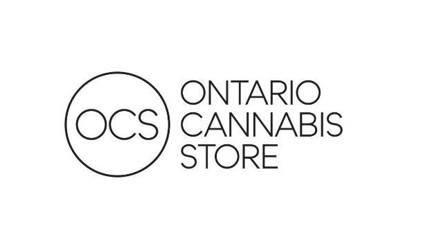
The province revealed Friday that it will name its pot-selling agency the Ontario Cannabis Store, or OCS for short. The store’s logo is a minimalist, sans-serif design in black and white.
It’s a major departure from the design approach for the Liquor Control Board of Ontario (LCBO) logo, which includes a whimsical curlicue and, at one time, was superimposed over a picture of a grapevine.
In contrast, the OCS logo does not include any depiction of marijuana.
The team behind the branding said the design was intended to convey a “safe, simple and approachable environment.”
“We are confident the brand name and logo will help ensure Ontarians are able to safely and easily identify Ontario Cannabis Stores as the sole legal retailer of non-medical cannabis in Ontario,” the team said in a statement.
That simple approach was met with both ridicule and praise on Twitter, where “Ontario Cannabis Store” was trending across Canada by mid-afternoon. Some social media users suggested that the design was purposefully boring.
The Ontario Cannabis Store seems to have taken a branding lesson from the one and only No Name. pic.twitter.com/Zl5QwSybup
— Chris Bellissimo (@cbelliss) March 9, 2018
I dunno, everybody is saying the Ontario Cannabis Store logo is boring, but if you flip it 90 degrees to the right, you can turn it into a fancy little cowboy on a saddle. #onpoli pic.twitter.com/dvIVWd1myu
— Mike Beauvais (@MikeBeauvais) March 9, 2018
Behold! Ontario #Cannabis Store #graphics
— Keith (@data_day_player) March 9, 2018
Quite "soccer mom friendly"
I think we may get something more stylized in several years, refer to LCBO logo history pic.twitter.com/KFVKQYqWd0
The logo for "Ontario Cannabis Store" which is where you'll buy weed in Ontario looks like a front for a business that used microsoft word to put something together. pic.twitter.com/NffTRredTl
— Bryan Wood (@itsWoodrow) March 9, 2018
Live look at the Ontario Cannabis Store design team when they send a draft as the final product. pic.twitter.com/ekgyCB8y5F
— 🇨🇦drian (@ehdrian_) March 9, 2018
But some suggested that the haters were going a bit overboard.
"I was going to go buy some legal cannabis but the logo for the Ontario Cannabis Store is trite and boring, so now I'm not going to" - literally no one ever.
— Ryan (@NorthTomorrows) March 9, 2018
so i get we're all design critics right now, but the #ontario cannabis store logo is really not that different than all the other gentrified weed brands out there pic.twitter.com/nY4XbKkRkE
— Dan Seljak (@DanSeljak) March 9, 2018
After the "Liquor Control Board of Ontario" and "The Beer Store", do we actually care it's "Ontario Cannabis Store"? Does it really matter? #ONpoli
— Ian Borsuk (@iancborsuk) March 9, 2018
Others even expressed admiration for the logo.
I enjoy both the Ontario Cannabis Store's name and logo.
— Emily S. Preston, Esq. (@trombonelegs) March 9, 2018
Simple, inoffensive, and most importantly, factual.
The Ontario Cannabis Store logo is not bad. It just looks more like an eyewear store logo tbh #ONpoli pic.twitter.com/BAgnA2frao
— Stefanos Kythreotis (@stefanoslg) March 9, 2018
I think the Ontario Cannabis Store logo is fine. Nice and simple, you don't feel like a fool walking into the stores.
— xRaaider (@xRaaider) March 9, 2018